One More Thing 2013
Posted 12 years, 49 weeks ago.
These are the notes I took during the talks at the One More Thing conference in 2013, including the slides which I’ve collected into one convenient place.
If you think there are any inaccuracies or if there’s something missing, please get in touch so I can ensure these notes are complete and accurate.
Karl von Randow (Camera+)
- Sometimes instructions don’t make sense until after you’ve completed them.
- If you have the opportunity to write assembly, do it, although it’s becoming a little redundant.
- We all know that Christmas in the App Store is a really important time.
- Christmas is just one day. It’s not something you can build a business on.
- The United States still accounts for around 50% of Camera+ sales.
- When you try things (like internationalisation), measure the results. Don’t do things haphazardly.
- iRate - library for prompting for reviews (also available in Cocoapods)
- If you’re not already using Cocoapods, you should be.
- Prompt for reviews in-app.
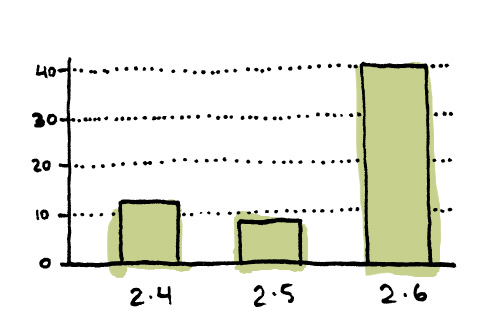
- Birdbrain received way more reviews after adding a prompt (using iRate).

A graph representing the increase in reviews of Birdbrain after placing a prompt in.
- Independent developers are the darlings of the App Store; we can embrace change more easily.
- Confront your fears.
- Don’t forget how great you can be when motivated.
- It’s hard, but it’s wonderful to be a beginner again.
Dave Wiskus (Unprofessional)
- Be memorable.
- Don’t be afraid to look stupid.
- Make yourself known.
- Be loud.
- Surround yourself with excellence.
- Act like you belong.
- Don’t be afraid to try new things.
- Ask yourself honestly “Will anybody care about this in a hundred years?”
- “The customer is always an asshole” — Mallrats
- “The universe is ambivalent” — Don Draper
Maggie Steciuk (Terrible Labs)
- Reasons you might not prototype:
- Deadlines
- You already have an idea
- Bad experiences
- Prototypes help us understand and communicate ideas.
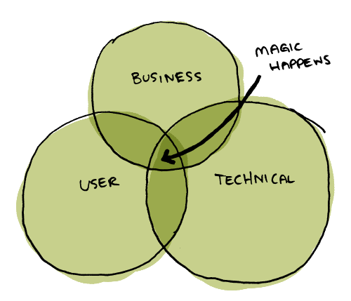
- Only when we solve business, technical and user problems does magic happen.

A venn diagram representing where the magic happens.
- People understand what they can see.
- When people understand us, they can give better feedback.
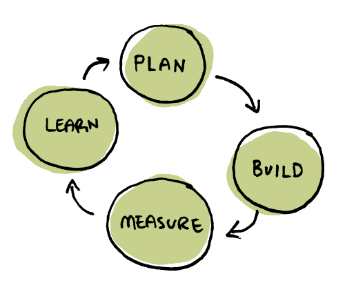
- Prototyping requires strategy and should be deliberate, but not dry or boring.

A diagram representing the flow of prototyping.
- Build something you can interact with ASAP.
- Your first idea might not be your best. More ideas typically turn into better ideas.
- Sketches invite broader feedback because they don’t feel finished.
- How done something looks = how done something is.
- Flinto - app for creating prototypes from sketches
- It only takes 5 users to uncover 85% - 90% of usability problems.
- Epiphanies are hard work.
- Sometimes the right tool is one you’re familiar with, or one you can share, or one that provides a necessary function.
- Proto.io - prototyping tool for mobiles
- We can’t just think our way to solutions, we have to discover our way to solutions.
- http://pbon.es/proto - list of prototyping tools
Li Xia (Mud Map/Camping)
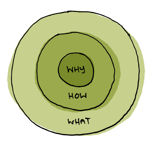
- The Golden Circle (Simon Sinek)
- What do you do?
- How do you do it?
- Why do you do it?

A diagram representing the Golden Circle.
- The what is really easy to understand, the why is much more difficult.
- Apple is a good example of a company that knows why they do what they do.
- What: build computers.
- How: easy to use.
- Why: because we believe in challenging the status quo.
- Understanding and believing in the why rallies people together and helps you do what you do.
- When you believe in something, and you communicate that belief, you attract others with similar beliefs.
Simeon Saëns (Two Lives Left)
- A good story has the ability to spread
- First two games didn’t do well because they didnt’ have a story that people wanted to share. There was no reason to talk about them.
- Codea - app for developing games on iPad
- Codea had an inherent story: it was the first app to allow you to develop games on the iPad.
- The story behind Cargo-bot was that it was the first game programmed on an iPad. This was clearly mentioned on the menu of the game.
- People wanted to share the story.
- Crabitron’s story (Crabstarter) didn’t work because many people didn’t see the story: they bought the app without visiting the website.
- Stories should be inherent, or the story should be tied into the app somehow.
Emma Stabey (Seek.com.au)
- Focus on the problems that you want to solve.
- Make the core features the best possible.
- Be clear about what your goals are.
- Just because a brand works on a desktop doesn’t mean it translates well to mobile.
- Be brave and suggest crazy things (because it leads to collaboration).
Louise Duncan
- Personalised
- Create
- Foldify
- Pixel press
- Connect
- Skype
- TIGed
- Deforest Apps
- Write
- Rory’s Story Cubes
- Literacy Planet
- Think
- iThought HD
- Augmented
- Kids LOVE augmented reality.
- Learning Flow
- Dropbox
- Evernote
- Computing
- Coder Dojo
- Apps for good
- Transmedia
- Inanimate Alice
- Contextual
- Museum of London
- Rainforest Heroes
- Learning analytics
- Nearpod
- Easy Assessment
- Infuse Learning
- Entrepreneurship
- Yong Zhao
- Problem-based learning
- SAMR
- If you are building an app for schools, always take proxies into consideration.
- WebDav
- Having the option to use an ‘Open in’ menu to move data between apps is important. Having this option will expand your horizons in education.
Amanda Rösler (Toca Boca)
- Toca Boca is focussed on creating apps that provide open-ended, imaginative and creative play.
- Design with kids, not for kids (Always include your target audience from the beginning).
- Design for magical interaction (Make the interactions obvious and fun).
- Design for children of all ages (Design for both casual and pro users).
- Get children involved in every step of development: prototyping, testing, and evaluating the concept.
- Let the user interact with the interface as if it were a tangible thing.
- Use visual hints instead of written instructions; but be sure they’re clear, e.g. Toca House scrolls through all the floors at first, to show that the user can scroll, and on subsequent loads it just bobs to give the same hint.
- Focus on a single experience. Two similar concepts don’t necessarily go together, e.g. buying ingredients (like in Toca Shop) and then cooking them (like in Toca Kitchen) is more complex than the two seperate activities alone.
- Design apps that are fun to use with simple interactions as kids get older.
- Allow for creative play, in fact encourage it.
Jaimee Newberry
- Make your copy fun… when it’s appropriate (which is pretty much always).
- Use a copy framework (Mad libs).
 (Taken from @jaimeejaimee’s tweet.)
- Tone is personality.
- Understanding the personality of your app is a huge thing.
- You’re allowed to have fun with you copy (example is ‘Moustache!’ as the copy on a login button on Carbonmade).
- There is a huge difference between “What are you doing?” and “What’s happening?”
- Creating Engagement on Twitter — Mark Trammell and Jesse James Garrett, UX Week 2011
- Copy is a fast, cheap, easy way to delight your users.
- Jaimee’s resources
Lex Friedman (Macworld/Unprofessional)
- Don’t copy other press releases. You just end up with a bad Michael Keaton (Multiplicity reference).
- Show how great your app is.
- Don’t compare your app to other apps, e.g. “X app on steroids” or “the instagram of video”.
- Don’t make me search for your app.
- Here’s the important information
- What is it called?
- What does it do?
- Why do I care?
- What does it look like?
- How do I get it?
- Include screenshots or make it easy to find them.
- Don’t follow up.
- Don’t spam my team. Pitch to the right person.
- If you can’t find the right person, send to the tip line (iphone@macworld.com).
- Embargo: you give me the news and the app ahead of time, and I promise not to write about it until you’re ready.
- You can’t just send some news and say it’s under embargo. Give a little information and offer more details under embargo.
- Think carefully about when the embargo should end.
- The App Store tells all. Use the tools available to control your release.
- If the embargo breaks, fix it. If someone accidentally publishes their story, let everyone else know that they can also publish.
- Don’t give me an embargo at the last minute.
- Omit needless words.
- Include a link to your app.
Scott Brewer (Art Processors)
- When you write apps, it’s not always about the app, but the other things it interacts with.
- Anything that holds someone up is just an excuse for them to hate you.
- Think about the user’s space.
- Just because that’s the way it’s been done doesn’t mean it has to be done that way.
- Polish your app. If people have trouble, they’re going to hate the experience and end up hating you.
- Squash every single bug.
David McKinney (Discovr/Connected.fm)
- Design isn’t just about making things look pretty.
- Design principles:
- Make it friendly
- Make it simple
- Make it for people
- Make it clear
- Make it about the content
- Make it talk
- Make it helpful
- Give it context
- Make it play
- Make it personal
- Make it real
- Make it again
Other Posts in this Series
- One More Thing 2012
- One More Thing 2013 (This Post)