iPad Pro, for Illustrators
Posted 10 years, 22 weeks ago.
The last iPad I purchased was the original iPad mini. When I got it, I was excited by the prospect of having a smaller device that would be easier to carry about; given that its size is roughly equal to some of the (paper) notebooks I already carry around, I thought it might be a better match for me than the 10”, 3rd-generation iPad which had preceded it. As always, however, my excitement over new tech subsided and I discovered that I used it less and less.
Now that I’ve had my iPhone 6 plus for over a year I’ve realised why: what I really wanted was a device that was both iPhone and iPad. One device to rule them all, so to speak. This, I think, has always been iPad’s failing point: the ecosystem is so similar to iPhone’s that many will find themselves questioning the need for both devices. As soon as that question rears its head, the battle is lost.
Obviously, the exception here is the iPad’s screen. Being as large as it is, it should make the device an excellent illustration tool, but I always found the experience ever-so-slightly lacking. The styluses have always felt imprecise, and palm rejection has never been amazing. This made drawing with the tablet feel like drawing on a whiteboard, which isn’t something I necessarily enjoy.
My decision to purchase an iPad Pro was reluctant to say the least. I obviously have no love in my heart for the iPad, but the idea of the Pencil brings its own excitement, albeit a cautious excitement. My track record with iPad styluses so far has been lacking, so would this be any different? Is the iPad even capable of being a device for professional illustration work?
I decided to buy one and trial it for a few days before I really made my decision. I mean, I could go into the Apple store and try one there, but I didn’t feel like I’d really be able to grasp the limitations without using it in my regular workflow, which I can’t do in-store. If all else failed and my fears were warranted, I could simply return the device (Apple’s return policies are quite amazing), and never look back.

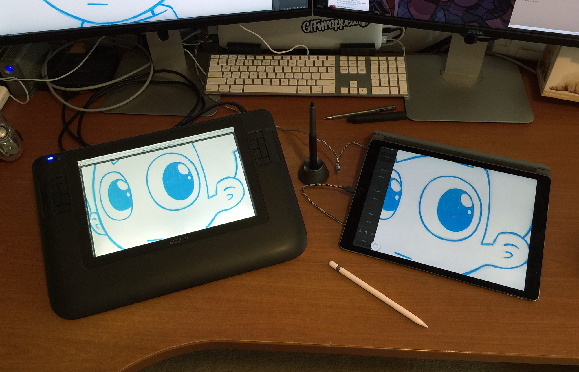
Brother from another manufacturer.
The Convenience Factor
In comparison to my 12” Cintiq (from 2011), the iPad is both bigger and smaller. The display of the iPad Pro is larger — not to mention, a different aspect ratio — than the Cintiq, but in terms of the device itself, it’s actually significantly smaller. My gut feeling is that this is also both good and bad, as the larger bezel of the Cintiq houses buttons that can be mapped to common tools, but it’s far less mobile a device, a fact made worse by the external box and cables which chain it to the desk.
I’ve always somewhat despised the Cintiq’s cable, which is not only thick but also inflexible. In an attempt to make it convenient to plug in when I need it, I’ve placed its box underneath my normal monitors. The unfortunate side effect is that the Cintiq’s cable, which is quite long for understandable reasons, winds all over the desk and has been known to press on my keyboard, leading to situations where modifier keys are being pressed and I don’t know why.
These factors lend to my feeling that the iPad is more convenient as an illustration tool. There’s nothing better than being able to grab it, open the appropriate app and draw. There are no cables to plug in, and if I do use the lightning cable, it’s not as hefty and unforgiving (though it does present its own set of problems).
Wanted, One Drafting Table
If you’ve ever watched a video that shows animators at work, you’ll notice that they work at a desk that sits at an angle. When it comes to illustration, this angle is much nicer to work at than a regular desk, as it’s easier on the wrists.
To compensate for this, the Cintiq has a kickstand which raises it to an appropriate level, and thus making it more pleasant for long-term use. The iPad, however, features no such kickstand, unless you consider the Smart Cover, which doesn’t quite work as well as one might hope.
For starters, the Smart Cover was never designed to imitate a drafting table. The intended use is to make typing on the keyboard easier, or standing the iPad on end for display, like a photo frame. The problem is that neither of these angles are ideal for illustration, where you want something in the ballpark of 35°.
The other issue here lies in the fact that the Smart Cover is designed hold the device at an angle where the lighting port is on the left side, getting in the way if you want to use your left hand to activate controls on screen, or even to just hold the device. Part of me wishes that Apple would move the port closer to one of the corners, but there’s no way this will happen in reality, given Jony Ive’s crippling love of symmetry.
In truth, this is more a problem for right-handers than left-handers (for once?), as I don’t see the issue being as big a deal for those drawing with their left hand. It’s also likely not that big a deal, and something I’m sure I’ll adapt to given enough time.
Pencils Down
Physically, the pencil is longer than its analogue counterparts, and even the Wacom’s stylus (by maybe a millimetre or two). It’s about as round as a regular pencil, though significantly heavier than the mechanical one I use. This isn’t necessarily bad: it feels good in the hand while sketching and its pencil-like shape certainly adds credence to its name, as it’s more like drawing with a pencil than a stylus in many respects.
The length poses a potential problem for portability in my mind, and given that we’re talking about a relatively delicate — and somewhat costly — instrument, this makes me more than a little concerned about how long the device will last before I break it.
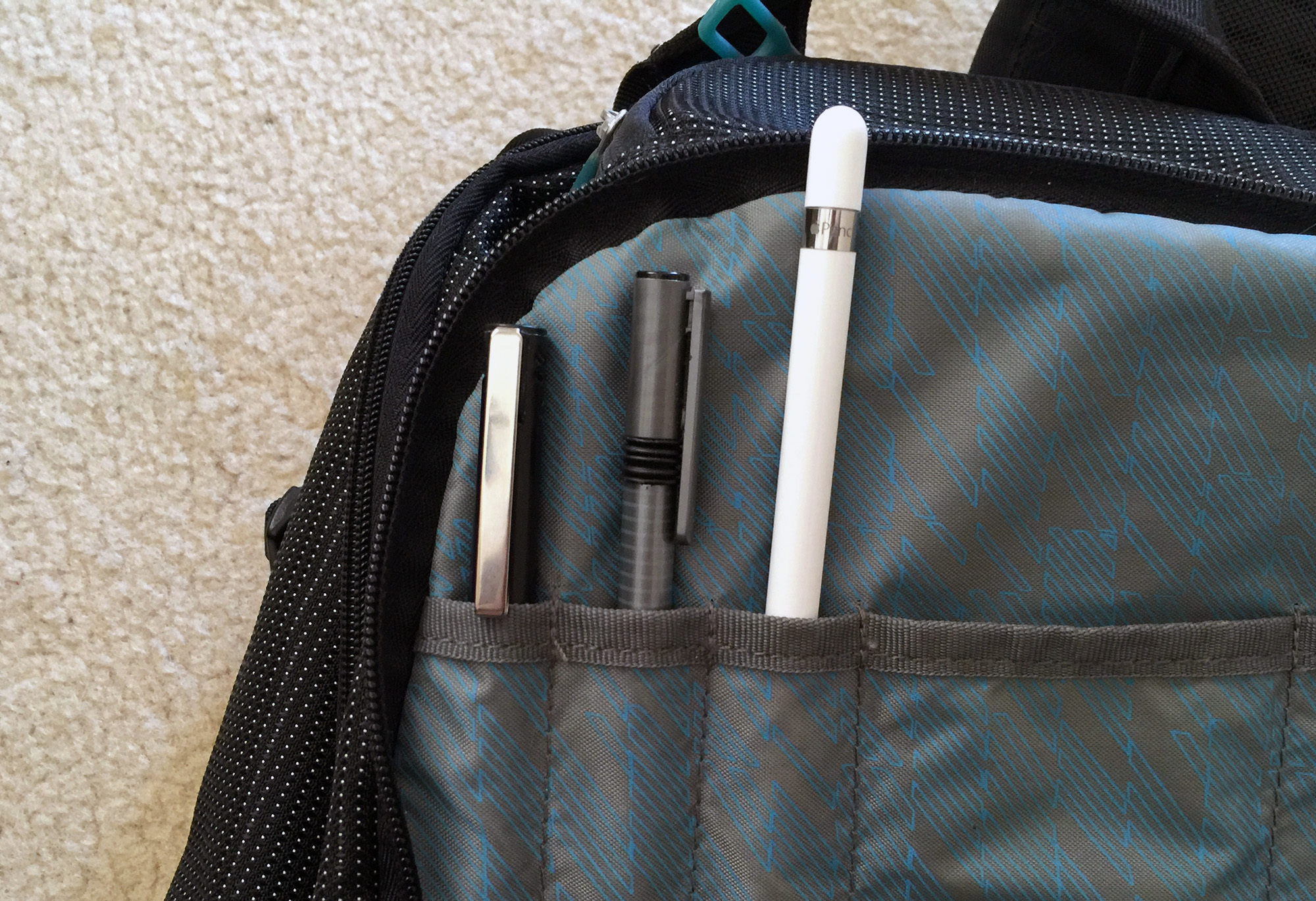
It’s actually significantly longer than the pockets provided by my bag. Long enough, in fact, that it extends beyond the bag itself and I can’t carry it that way. Letting it float free isn’t really my idea of a good time either, given the stories about how delicate the extremities are. I suppose time will only tell how people deal with this problem.

The pocket is probably just holding it wrong.
The tip of the Pencil is rounded, as if you’ve been using its namesake for a while without sharpening. It’s also much more “blunt” than the Wacom’s stylus, but I actually don’t think this has affected me much. It feels precise, especially in comparison to the other iPad styluses I’ve used.
I’ve also found the “shading” gesture of holding the pencil sideways a nice touch, but also a little trigger happy. Holding the pencil at a normal angle seems to be a hair’s width away from triggering the effect in many apps, and I do constantly find that I’m setting it off without intending to.
The one thing I feel like the Pencil is truly missing is an eraser on the opposite end of the pencil. This is something the Wacom stylus has, not to mention my mechanical pencil, and it’s incredibly handy. In one deft move you can go from drawing to erasing, just by manipulating the instrument with one hand. It’s taken me a few days to adjust my habits here, and it’ll take a while longer to really get it out of my system, but I don’t think I’ll ever stop wishing the feature was there.
Overall, the Pencil makes for a great stylus, but if you’re looking for a comparison with its analogue counterparts, it lies somewhere between a weighted pen and a pencil. This isn’t necessarily bad — it is what it is — and while it probably needs a few small tweaks, it’s definitely worth the excitement.
Bring in the Software
My Cintiq brings with it the versatility and depth of Photoshop with all the features that has to offer. As such, software on the iPad has a lot to live up to in filling this void.
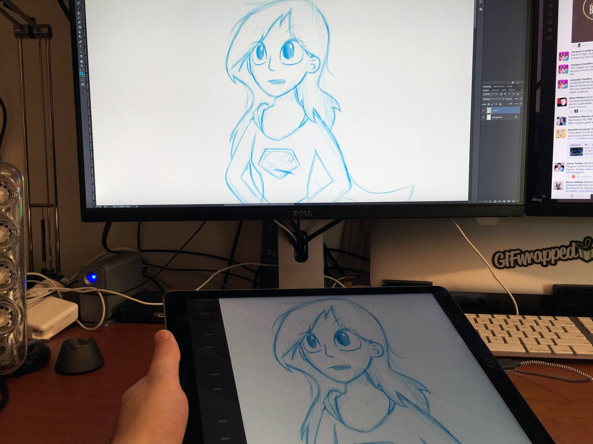
Fortunately, there’s at least one app out there that flaunts itself as a way to turn your iDevice into an actual graphics tablet, and that’s Astropad (App Store). The app mirrors a portion of your Mac’s screen to the device and allows you to draw with a stylus. It also handles the pressure sensitivity as well as the Cintiq, but doesn’t appear to support tilt just yet.
There are of course small downsides to Astropad, like having to dedicate at least part of your other screen to Photoshop, and the delay between making a stroke with your Pencil and that stroke making the round to your Mac and back, but none of these kill the usefulness of it as a tool.

Astropad might have limitations, but it’s super useful.
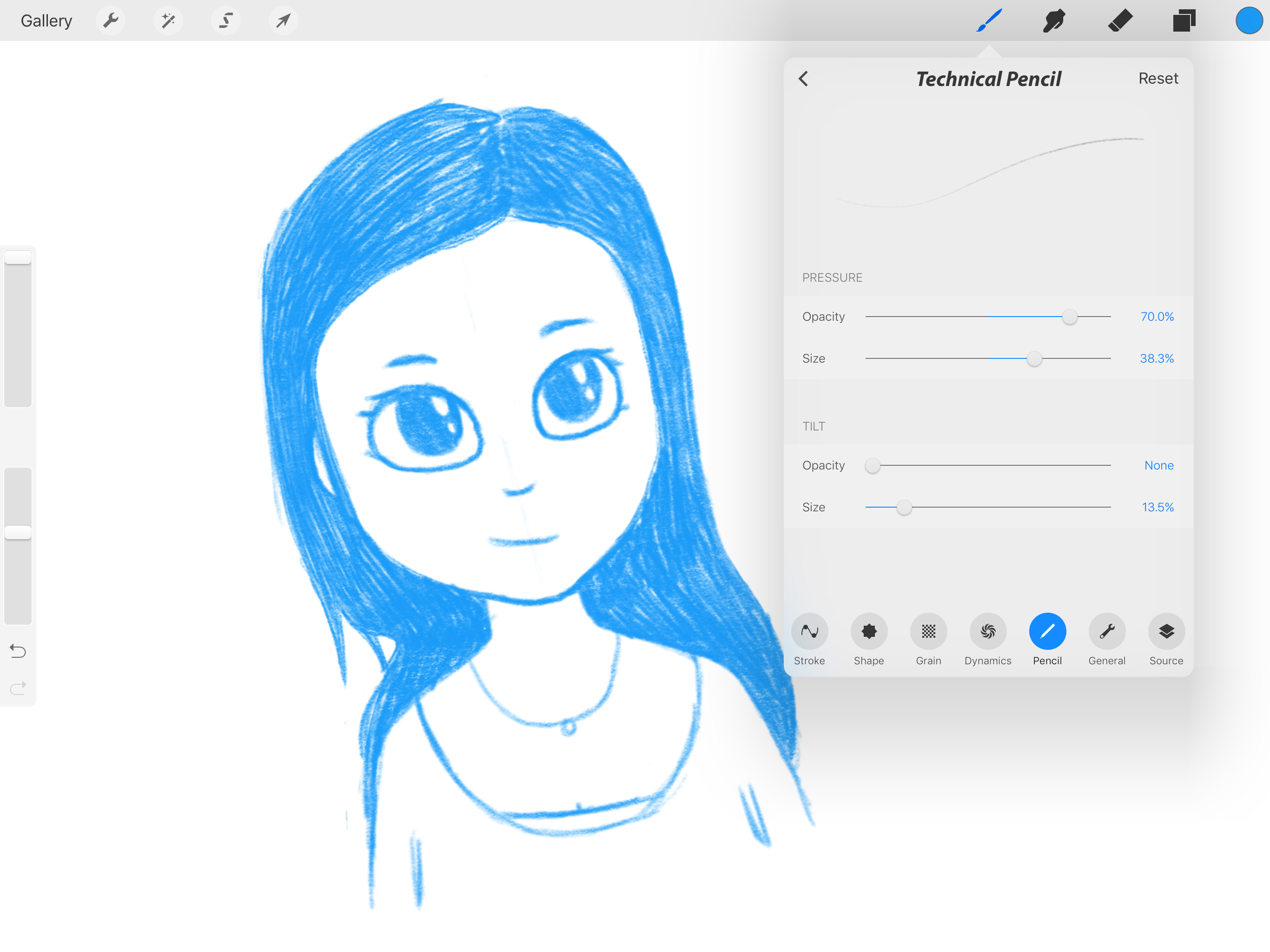
For times when connecting to my Mac isn’t an option, I’m finding that Procreate (App Store) offers the best range of tools and features, including incredibly in-depth brush settings. These might sound complex, but they allow you to tailor things to work better for you (like that trigger happy tilt effect), and then you’ll likely never touch them again.
Procreate also features layers, which are invaluable for being able to properly complete an illustration. You can sketch on one layer, then ink the illustration on a layer above, and finally colour behind the inks to create a complete illustration.
If I had my way, I’d tweak the UI of Procreate a little, and maybe add a feature or two here and there, but it’s impressively close to having Photoshop away from a Mac, and my first choice when I want to sketch on the couch (though not close enough to actually replace Photoshop for me).

Procreate includes settings for the Pencil’s pressure and tilt features.
There are, of course, other apps, such as Adobe Sketch, FiftyThree’s Paper, and the built-in Notes. The problem is, I don’t feel like any of these were really designed for illustrating, per se: they feature a limited set of brushes and no real layer abilities, so it seems they are mostly limited to, and likely designed for, sketching ideas.
This is somewhat illustrated (hah!) by Paper’s origin as a sort of digital sketchbook app. Many artists have a Moleskine or similar book that they sketch in for fun (or practice), where there is little concern for adding colour or cleaning the image up. I feel like the very nature of these apps targets (and actually excels at) this sort of usage.
Final Thoughts
So as I said in the beginning, my initial plan with the iPad Pro was to try it out for a while, in real use, and decide if it could work as a replacement for my Cintiq. It’s roughly equivalent in cost with many of the same features, but overall I think it wins out based on convenience alone. That is to say, I’m not planning on returning it any time soon.
While I do feel like it has a number of drawbacks in comparison with the Cintiq, I don’t feel like they outweigh its benefits. Most of them are also limitations in the software, something that will inevitably improve as time goes on.
Despite its flaws, I feel like I’ll be able to do more sketching and illustration with this device in my bag than I ever have before, and who knows… maybe it’ll even be a part of the creation of my next app. Regardless, it’ll definitely play a big role in my work from here on out, something that no other iPad has achieved to date.